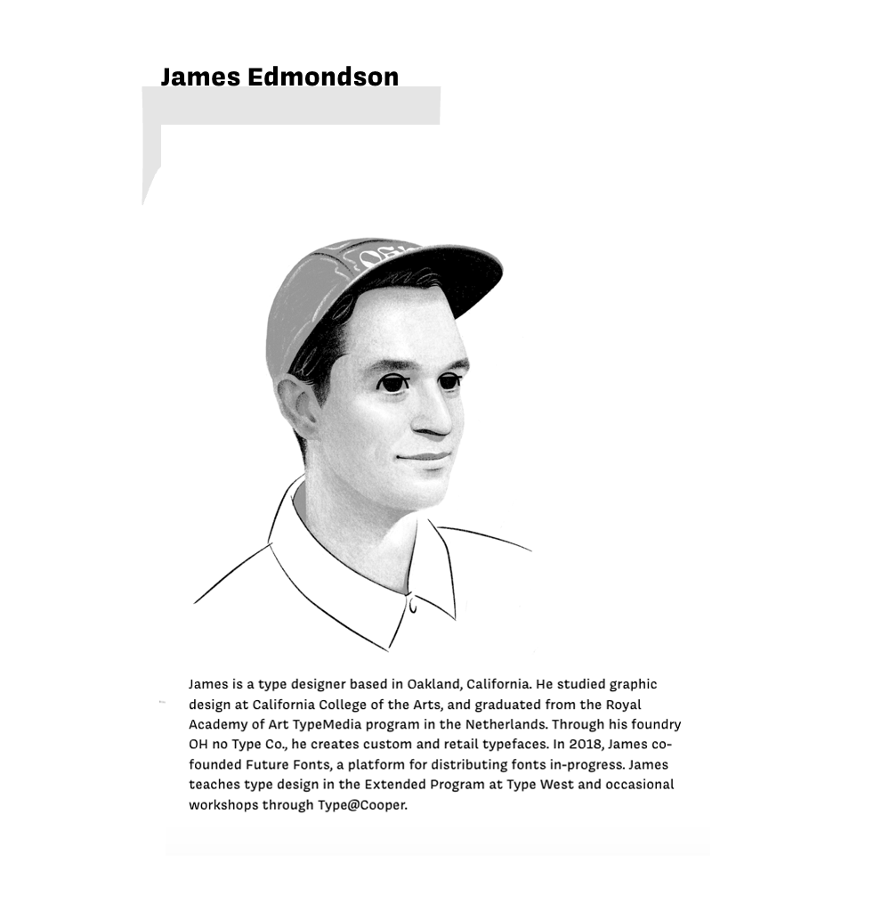
James
Edmondson
Contemporary Type Designer and Founder of OH no Type Co.
James Edmondson is a contemporary type designer known for creating expressive typefaces that combine strong visual personality with practical use. His work shows how typography can shape mood, identity, and visual atmosphere rather than simply support readability. This website explores Edmondson’s influence on contemporary typography, with a focus on his typeface Swear and the way his work uses hierarchy, structure, and composition to create distinctive visual communication.
About
Intro
James Edmondson is a contemporary type designer known for creating expressive typefaces that combine strong visual personality with practical use in modern design. The fonts that he designed have strong recognition compared to neutral fonts that disappear into the background. He designs typefaces that shape the tone, mood, and identity of a page. OH no Type Co. emphasizes organic structure over geometric form, values liveliness over perfection, and prioritizes good spacing in its type design approach (OH no Type Company, n.d.).
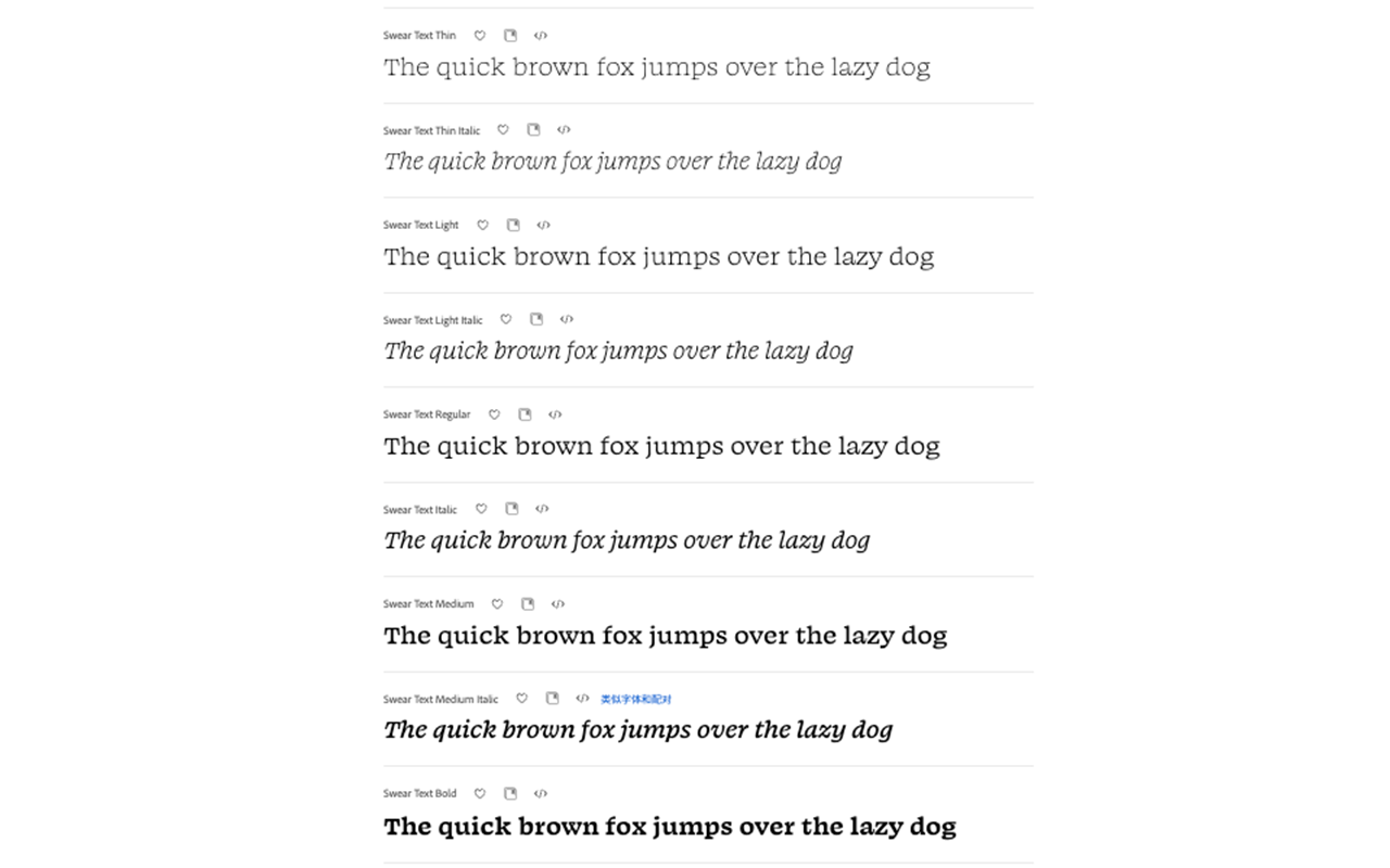
Swear is a strong example, its serif structure feels dramatic and stylish, but the family is also highly developed, with multiple weights and optical sizes that make it adaptable to different design contexts. According to Creative Characters S1 E12: James Edmondson: Let the design be what it wants to become, Edmondson’s portfolio comprises a diverse array of psychedelic swirls, fluid curves, and innovative reinterpretations of everyday styles, each characterized by dynamic energy and distinctive personality.
This makes Edmondson influential in contemporary typography because his work shows that type can do more than support written content. It can also become a central part of visual communication. In branding, web design, and digital media, designers increasingly use type to create atmosphere and identity. Edmondson’s work reflects and strengthens this shift, making his typefaces relevant to how typography is used today. In this way, Edmondson’s work reflects a broader shift in typography: type is no longer treated only as a tool for readability, but also as a key element of design expression.
Organic over geometric, lively over perfect, and good spacing above all else.
Contribution & Influence
Major Contribution
James Edmondson’s most significant contribution to typography is creating typefaces that are highly expressive while still remaining practical for contemporary design use. OH no Type Company explains that Edmondson founded the foundry in 2015 with a background in lettering and a strong appreciation for lively, beautiful, and readable typefaces (OH no Type Company, n.d.).This contribution is important because expressive typefaces are often difficult to balance. A font with too much personality may attract attention at first, but it can quickly become limited if it only works as decoration. On the other hand, a typeface that is designed only for clarity and neutrality may function well, but it may also fail to leave a memorable impression.
Edmondson’s work is significant because it often finds a middle ground between these two extremes. His typefaces are visually distinctive and full of character, yet they are also structured carefully enough to be used across a range of modern design situations. Swear is a strong example of this contribution. Although it has a dramatic and stylish serif structure, it is not limited to decorative use. Its multiple weights and optical sizes make it more flexible across different design contexts, including branding, websites, and large-scale display settings. This means that the typeface can create a strong visual identity while still adapting to practical communication needs.
Designing an expressive typeface is not difficult by itself, but creating one that can still work effectively across different contexts is much more challenging. If a typeface becomes too decorative, it may lose flexibility and be used only for special effects. If it becomes too neutral, however, it may lose personality and fail to create a strong impression. Edmondson’s work is important because it often sits between these extremes. His contribution also matters because it expands the role of typography in modern visual communication. Instead of treating type only as a tool for readability, Edmondson’s work shows that type can also create mood, identity, and a stronger visual presence. His designs suggest that typography is not only a technical system for organizing text, but also a central part of how a design communicates meaning and emotion. As a result, his typefaces help redefine how typography functions in contemporary branding, web design, and digital media. Rather than separating expression from usability, Edmondson demonstrates that the two can work together, and this is what makes his contribution especially valuable to the field of typography.
Influence on Typography
Edmondson’s contribution has influenced the way contemporary designers use expressive typography in branding, web design, and digital media. James Edmondson’s contribution has influenced contemporary typography by encouraging designers to see expressive typefaces as practical tools for communication, not just decorative elements. His work encourages designers to use typography not only for readability, but also for mood, identity, and visual impact (OH no Type Company, n.d.). This influence can be seen in areas such as branding, website design, and digital media, where typography is often expected to do more than deliver information. In these contexts, type helps create mood, define identity, and make a visual system feel more distinctive.
Edmondson’s work supports this direction by showing that strong personality and practical use do not have to be separated. His contribution has also influenced the broader understanding of typography itself. Rather than treating type as something secondary to layout or image, contemporary design increasingly treats typography as a central expressive element. In this sense, Edmondson’s work reflects and strengthens a wider shift in the field, where type is used not only for readability, but also for atmosphere, character, and brand presence.
This influence is especially visible in projects that rely on strong visual identity. Designers today often choose typefaces not only for clarity, but also for the emotional and stylistic qualities they bring to a page or brand. Edmondson’s work helps support this way of thinking by proving that expressive typography can still remain functional across different design situations.
Typography can be both practical and visually distinctive.
Typeface Analysis
Introduction
Swear is a serif typeface designed by James Edmondson that stands out for its strong visual personality and refined sense of design. “With its unique forms and refined charm, it delivers a strong visual presence that elevates bold headlines, character-driven branding, and creative display layouts seeking personality and style.” (Befonts, 2025) Unlike more neutral serif typefaces that are mainly used to support long passages of text, Swear is immediately carefully shaped, which gives it a strong presence on the page. Because of this, the typeface does more than present words clearly. It also helps define the tone and identity of a design.
Visual Character
One of the most notable qualities of Swear is the way it combines expressiveness with control. The typeface feels visually rich and memorable, but it does not appear random or purely decorative. Instead, its letterform feels intentional and designed with a clear aesthetic direction. This gives Swear a sophisticated character that works especially well in large headlines, branding, and digital layouts where typography is expected to attract attention.
Family Structure
Another important part of Swear is its flexibility as a type family. Its multiple weights and optical sizes make it more adaptable than a single display font. This allows the typeface to be used in a wider range of design situations while still keeping its distinctive voice.
Use in Design
In this way, Swear is a strong example of Edmondson’s approach to typography. It shows how a typeface can be expressive, recognizable, and visually powerful while still remaining practical in contemporary design. Swear is especially effective because it gives typography a stronger design role. Instead of acting only as a neutral container for information, it makes type part of the visual experience itself. This is important in contemporary design, where type is often expected to create atmosphere and visual identity as much as readability. For this reason, Swear is not only a memorable typeface, but also an example of how typography can communicate style, mood, and purpose at the same time.
Typographic Composition
Hierarchy
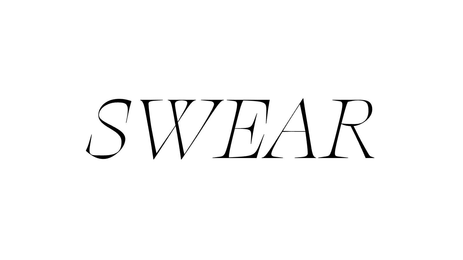
The typographic composition is effective because it uses scale, spacing, and placement to make the word “Swear” the dominant visual element on the page. The oversized letterforms immediately capture attention and create a strong focal point, while the much smaller labels and supporting text provide secondary information without competing with the main display. This creates a very clear hierarchy and makes the viewer’s reading path easy to follow.
White Space
Another important feature of the composition is its generous use of white space. The open space surrounding the main word isolates it visually and gives the layout a refined, highly controlled appearance. Rather than making the page feel empty, the white space increases emphasis and allows the typography to carry the visual impact of the composition. The contrast between the large display word and the quiet, minimal supporting text also strengthens the design. It shows how typography alone can organize a page and create atmosphere without relying on images or decorative graphics.
Scale and Visual Impact
In this composition, the typeface functions as both information and image. The result is a layout that feels stylish, deliberate, and visually distinctive. This makes the composition a strong example of how Edmondson’s work uses typography not only to communicate content, but also to create hierarchy, mood, and visual identity. The composition is also successful because it demonstrates the personality of the typeface through layout rather than explanation alone. The viewer does not simply read about Swear; they experience its dramatic presence directly through scale and spatial balance. In this way, the page acts as both a specimen and a visual argument for the expressive strength of the typeface.
Typography becomes the composition itself.
References
- Creative Characters S1 E12: James Edmondson: Let the design be what it wants to become. (n.d.). Monotype. https://www.monotype.com/resources/podcast/creative-characters-ep-12-james-edmondson
- Swear font Combinations & Free Alternatives · Typewolf. (n.d.). Typewolf. https://www.typewolf.com/swear
- Befonts - Download free fonts. (2025, November 18). Swear font family. Befonts – Free Fonts Download. https://befonts.com/swear-font-family.html
- Swear Display from OH no Type Co. (n.d.). https://fonts.adobe.com/fonts/swear-display#details-section+swear-display-black-italic
- Swear Text from OH no Type Co. (n.d.). https://fonts.adobe.com/fonts/swear-text#about-section
- Team | OH no Type Company. (n.d.). OH No Type Company. https://ohnotype.co/info/team